At Yi Ling's request, I've decided to post up pictures of the past-editions of my school mag, The Marguerite. I'm too lazy to find all of them now, so I'll post up those I currently have with me, and the rest can wait.
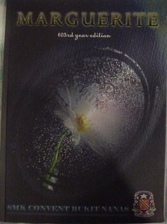
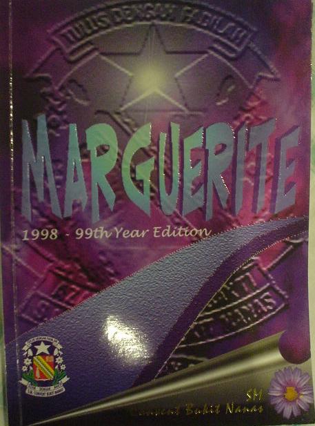
 This is Marguerite, the 1998-99th Year Edition. It is completely cacat-ed. You can even see the pixelly lines along the letters. Anyway, it's just the words and a pink and purple version of the school badge. Any kid could do that.
 And THIS, is Marguerite 1999. The 100th Year Edition. Better than the last, but still boring. It's just a pic of the school with a purple star border. I'm assuming they didn't have photoshop back then.
 The Millenium Edition. Doesn't look too futuristic to me. It's just a pic of the school (again) sliced up and scattered all over the page.
 Marguerite 2001. MUCH NICER. Much more imaginative, though I don't really like the colour scheme, it's GREAT compared to the other lame-o versions. Great job!
Marguerite 2002. This is OK. That about sums it up. Nicer, clean-cut images, but otherwise bland. Someone must have learned how to use Photoshop.
Sorry, year 2003-2005 are downstairs, and I can't be bothered to go and fetch them. I'll post them up tomorrow. Things have improved a tad since 2002, though. =)
And here's my poor effort at designing a magazine cover. I'm gonna try for that nifty little hamper the Majalah club is offering for the best cover. I don't think I'm going to win though. I feel so discouraged, cause my mom didn't like it. Though I think she just doesn't like black. =(
And the 107th Edition of Marguerite (I haven't decided on which to pick yet):
 This is Marguerite, the 1998-99th Year Edition. It is completely cacat-ed. You can even see the pixelly lines along the letters. Anyway, it's just the words and a pink and purple version of the school badge. Any kid could do that.
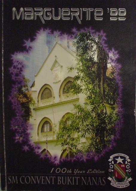 And THIS, is Marguerite 1999. The 100th Year Edition. Better than the last, but still boring. It's just a pic of the school with a purple star border. I'm assuming they didn't have photoshop back then.
 The Millenium Edition. Doesn't look too futuristic to me. It's just a pic of the school (again) sliced up and scattered all over the page.
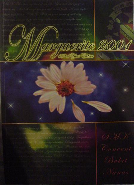 Marguerite 2001. MUCH NICER. Much more imaginative, though I don't really like the colour scheme, it's GREAT compared to the other lame-o versions. Great job!
Marguerite 2002. This is OK. That about sums it up. Nicer, clean-cut images, but otherwise bland. Someone must have learned how to use Photoshop.
Sorry, year 2003-2005 are downstairs, and I can't be bothered to go and fetch them. I'll post them up tomorrow. Things have improved a tad since 2002, though. =)
And here's my poor effort at designing a magazine cover. I'm gonna try for that nifty little hamper the Majalah club is offering for the best cover. I don't think I'm going to win though. I feel so discouraged, cause my mom didn't like it. Though I think she just doesn't like black. =(
And the 107th Edition of Marguerite (I haven't decided on which to pick yet):
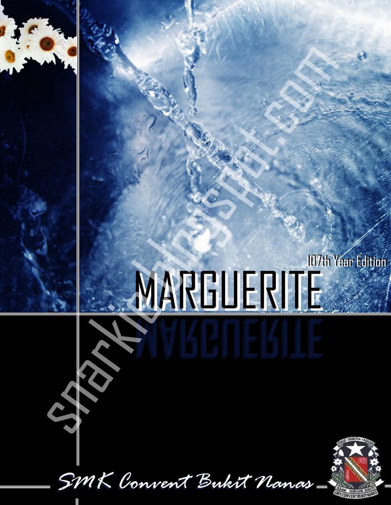 Version 1: Plain (Click for better view)
Wondering if I should keep it simple, or...
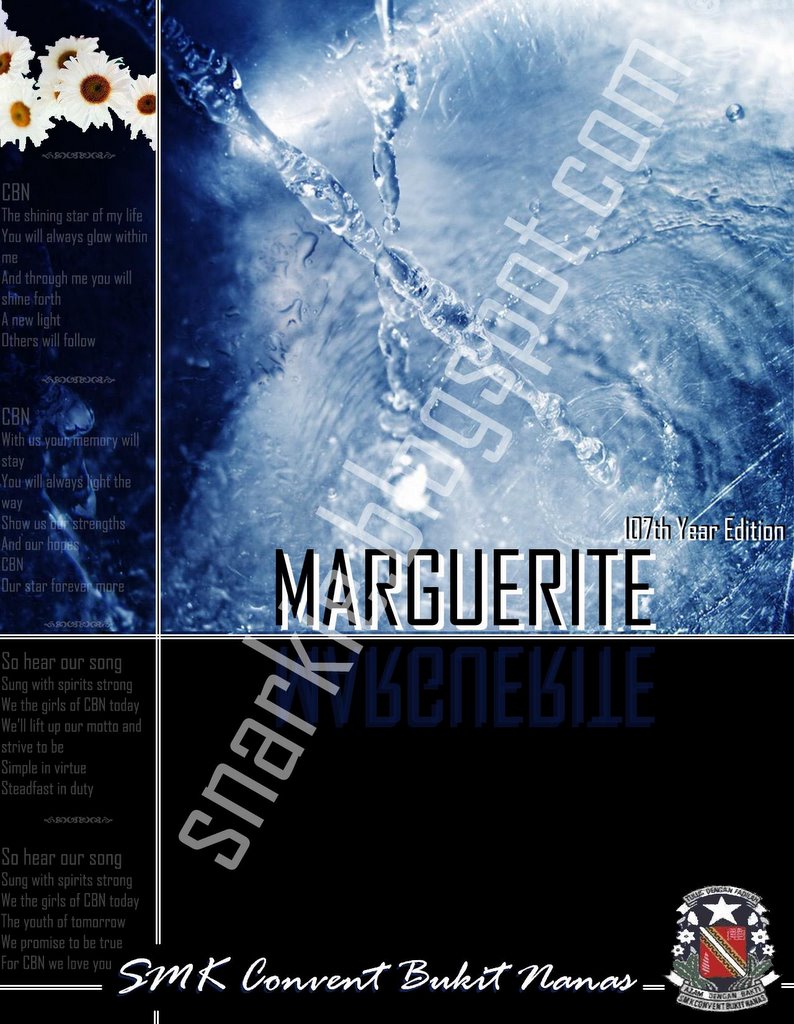 Version 2: Not-so-plain (Click for better view)
...make it a LITTLE more interesting. This has semi-transparent lyrics of the school song on the side. I'm still undecided whether it makes the cover look nicer, or more cluttered. (And ok, I shouldn't be the one to criticize other people's work, mine is bland as well =P)
As for the words across the page? Sorry for the paranoia, there's a hamper at stake you know!
Not that it could stop a determined thief, but if it gets stolen, back me up and say you saw it here first, ok? =D
P.s Sorry about the poor quality of the photos, the cam battery was running out and I was rushing. Besides, my cam has a parallex error. Grr.
Not that it could stop a determined thief, but if it gets stolen, back me up and say you saw it here first, ok? =D
P.s Sorry about the poor quality of the photos, the cam battery was running out and I was rushing. Besides, my cam has a parallex error. Grr.
3 comments:
I like your 2nd version better =) Hopefully yours gets chosen.
Hahaha. I think your designs are quite nice, but I don't quite like the font that you used for 'Marguerite' because I think it makes it look a bit too robotic and a lot less prominent. Well, that's just my opinion. Other than that, I think it's refreshing compared to the rest...Good luck!
Ahhh, but we CBNers ARE robotic.=P I mean, look at all the rules we have now...how come we can't keep misai? What would my sis do if she was still in school? =D
K/d, I'll see what I can do about the font. ;o)
Post a Comment